


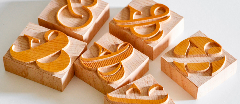
The ampersand (&), often called the “commercial and,” is one of the most distinctive and fascinating characters in typography. Admired by many type designers for the creative freedom it offers, this symbol also has ancient origins that aren’t widely known.
The symbol goes by different names in other languages—“e commerciale” in Italian, “esperluette” in French, and “Et-Zeichen” in German. The term “ampersand” was officially added to the English language in 1837.
Historically, the ampersand was included at the end of the English alphabet until the early 20th century, following the sequence “X, Y, Z, and per se and,” meaning “X, Y, Z, and the symbol that stands for ‘and.’” Over time, “and-per-se-and” naturally evolved into the modern word “ampersand.”
Historical Background and Progression

Although the English language later formalized the term, the creation of the ampersand dates back to the 1st century BC. It is attributed to Marcus Tullius Tiro, a Roman who began as a slave and secretary to Cicero and later earned his freedom. Tiro continued recording Cicero’s writings and, in 63 BC, developed a shorthand system known as the Tironian Notes to increase writing speed.
In ancient Roman script, the ampersand began as a ligature formed by joining the letters e and t—the Latin word et, meaning “and.” This practice persisted in later Roman writing styles, which featured many such ligatures. Although their use declined with the transition from Latin to Carolingian scripts, the ampersand survived and gradually evolved into a more stylized form, eventually obscuring its original shape.
By the late 8th century, the ampersand had become a standard tool for scribes, helping them save space within manuscripts. It was especially useful for producing justified text layouts, ensuring that each line maintained a consistent length.

With the arrival of movable-type printing in Europe in 1455, the ampersand continued to serve printers well. It adapted easily across serif and sans serif typefaces and helped streamline the composition process by replacing longer words with a single character. This practical function remained consistent with how it had been used since the Carolingian era.
During the Renaissance, italic typefaces emerged, bringing with them more expressive and decorative versions of the ampersand. Designers explored increasingly artistic interpretations, giving rise to the highly stylized italic ampersands still admired today.
The Ampersand in Modern Typography…
Today, the ampersand appears in virtually every typeface designed for the Latin alphabet. Each new font includes its own interpretation of the character, with italic styles often showing the most expressive variations—yet all remain rooted in the original “e” + “t” structure.
Fonts like Rotis Sans, Trebuchet, and Bebas Neue make this structure especially visible, separating the underlying forms more clearly.

The Carolingian-style ampersand remains the most widespread version. It appears across iconic serif families such as Didot, Bodoni, and Bembo, as well as popular sans serifs like Akzidenz Grotesk, Helvetica, and Univers.


Italic ampersands, on the other hand, tend to draw from calligraphic traditions. With their fluid lines and dynamic curves, they offer designers a rich palette of graceful, expressive forms.
Highlighted by Baskerville italic, Palatino italic, Adobe Caslon italic, Garamond italic, Sabon Italic, and Monotype Corsiva italic.

Renaissance calligraphers such as Ludovico degli Arrighi and Robert Granjon, and later type designers like Robert Slimbach with his 1992 Poetica typeface, contributed to the wide range of ampersand styles we have today.
The Ampersand in Brand Identities!
The ampersand has become an iconic element in branding and visual identity, appearing in the logos of many globally recognized companies. It features prominently in brands such as AT&T, M&M’s (Mars & Murrie), Head & Shoulders, Toni & Guy, and numerous others—serving not just as a connector, but as a distinctive graphic mark.

Some cultural institutions and creative agencies use the ampersand as a central design asset. Notable examples include the Victoria and Albert Museum (V&A), the branding studio &Walsh, and publisher Mondadori Electa, all of which incorporate the symbol as a defining feature of their identity.

Museum, & Walsh, and Mondadori Electa logos.
In fashion branding, the ampersand appears across both luxury and mass-market labels. It can be found in names such as Dolce & Gabbana, & Other Stories, H&M, and Pull&Bear, showcasing its versatility across styles and industries.

The ampersand’s continued presence across so many sectors highlights its unique blend of function and aesthetics. Once a simple ligature designed to save writing space, it now stands as a powerful symbol in modern visual communication.