

Quotations, a diverse mix of genres, a handful of obsessions, and a generous dose of extravagance: these are the hallmarks of Quentin Tarantino’s style, which unmistakably extends to the typography featured in the opening credits of his films. How many other directors could seamlessly incorporate four different font styles within just a few seconds, as seen in Kill Bill? There are also nods to spaghetti-western typography, borrowed fonts from 1970s B-movies, and certain typefaces that recur throughout nearly his entire filmography.

In short, even when it comes to typography, the master of American cinema continues to surprise us. Below is a collection featuring some of the most iconic opening title sequences from Tarantino’s legendary films.
Reservoir Dogs
Reservoir Dogs, Tarantino’s debut film, was made on a shoestring budget—so much so that some actors had to supply their own clothes and even their own cars for certain scenes. Perhaps this is part of what gives the film its unique charm, somewhere between amateur grit and classic cop thriller. This vibe is evident right from the opening credits.

http://annyas.com/
The characters are shown in slow motion during their now-famous walk, with their names displayed on screen in the Palatine font, tinted in a mustard hue that would become a signature element in many of Tarantino’s later films. A 1970s hit plays in the background, setting the tone. The film title appears in the timeless Garamond font—an elegant typeface originating in 16th-century France and refined over the centuries. Interestingly, it also holds a peculiar record in Italy, as we’ve discussed before.
As the credits roll smoothly and rhythmically, the soundtrack hints at a shift: the music fades, replaced by unsettling wails in the background. Remember who’s in trouble?
Pulp Fiction
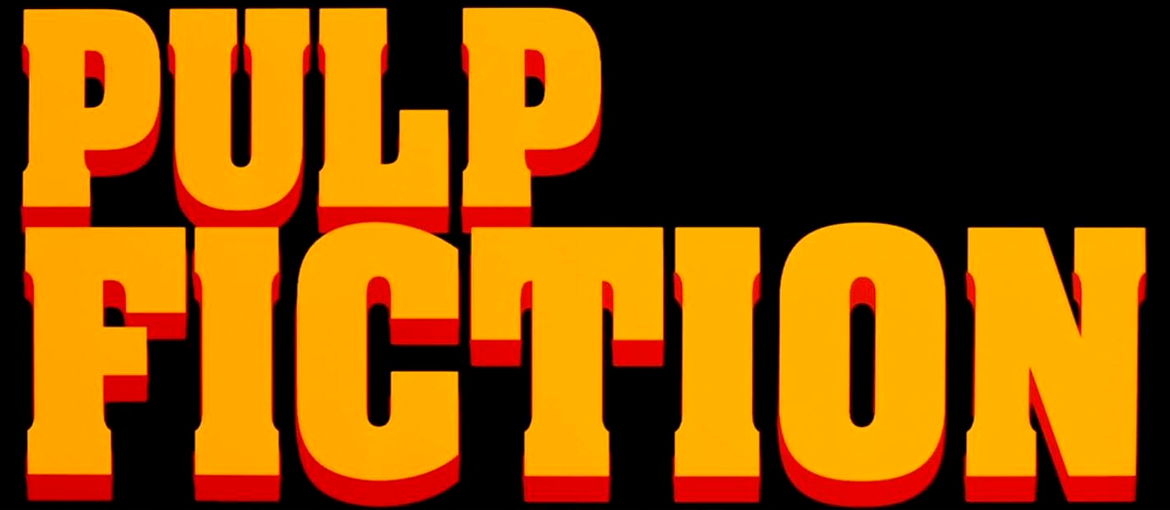
Arguably Tarantino’s most famous work, Pulp Fiction marks the start of an important collaboration between the director and Pacific Title, a Hollywood company specializing in film titles since the silent era. Pacific Title—and designer Jay Johnson in particular—would go on to craft the title graphics for all of Tarantino’s subsequent films.

http://annyas.com/
After showing the dictionary definition of “pulp” from the American Heritage Dictionary in classic Times New Roman, the opening sequence immediately sets the tone for the next two hours: sharp dialogue, shady intentions, and nods to 1970s pop culture.
The first credits use ITC Busorama, a sans serif typeface created by Tom Carnase in 1970 that blends art deco influences with a quirky, playful feel. The iconic film title then rises boldly from the bottom of the screen in the 1969 Aachen Bold font. Overlaid in white are the actors’ credits, most likely set in a modified version of ITC Benguiat, an elegant typeface designed by Ed Benguiat in 1977—which also appears in the logo of a certain well-known TV series.
Then someone switches the radio station, and suddenly we’re riding in a Chevy with John Travolta and Samuel L. Jackson.
Jackie Brown
Tarantino’s films are full of references—to underground cinema, Italian poliziotteschi, and B-movies. In Jackie Brown, the director’s third and perhaps least-known film, everything—including the typography of the title—pays homage to blaxploitation cinema.

The film title reinforces the funky vibe with the ITC Tiffany typeface, another creation by Ed Benguiat in 1974. The primary inspiration is the poster for Foxy Brown, a 1974 blaxploitation film starring the same lead actress chosen by Tarantino: Pam Grier. Even the typeface used in the Foxy Brown logo is by Benguiat as well: Benguiat Caslon.
Inglourious Basterds
The use of typography in Tarantino’s opening credits often mirrors his filmmaking style. And if there’s one thing Tarantino enjoys, it’s appearing in his own films. His cameos are numerous: in Pulp Fiction, he finds himself in a tight spot with John Travolta and Samuel L. Jackson, and in Reservoir Dogs, he’s part of the gang.

Somehow, even in the opening credits of Inglourious Basterds, the director manages a cameo of sorts. The film’s title is shown in his own handwriting, taken from the cover of the final screenplay he completed in July 2008.
The Hateful Eight
Tarantino’s pair of westerns offers a perfect opportunity to rediscover spaghetti westerns—even typographically.

The typeface used for The Hateful Eight’s title—Tarantino’s eighth film—was created by Jay Johnson, drawing inspiration from a wide range of spaghetti westerns. In particular, the title’s playful lettering recalls the work of Iginio Lardani, often considered the “Sergio Leone of title design,” known for crafting some of the genre’s most iconic openings. Meanwhile, the cast credits, set in mustard-colored ITC Bookman, serve as a gentle reminder—if it wasn’t already obvious—that we’re watching a Tarantino film.
Once Upon a Time in Hollywood
Tarantino’s most recent film is a tribute to Hollywood, blending homage and nostalgia: vintage clothing, classic cars, retro posters, and a wealth of period typography.

One of the film’s standout moments—especially for design lovers—is the sequence in which Hollywood’s neon signs slowly flicker on, offering thirty seconds of pure immersion in 1960s graphic design.
As for the opening credits, Once Upon a Time in… Hollywood begins with the familiar presence of ITC Bookman and ITC Busorama, both shown in Tarantino’s trademark mustard tone. Interestingly, the film’s title doesn’t appear until the end credits, perhaps marking the conclusion of this modern fairy tale.
In conclusion, Tarantino’s typographic choices are deeply intertwined with his filmmaking style, enhancing his distinctive and now iconic body of work. From recurring elements like Bookman and Busorama to typefaces that pay homage to entire aesthetic movements—such as the Western genre or the funky style of Jackie Brown—there’s a clear sense of Tarantino’s personal touch in every letter.