
According to the dictionary, a résumé is “a summary of a person’s education, professional experience, achievements, and qualifications.” But in today’s fast-paced job market, that definition misses one crucial truth: recruiters often spend just six seconds deciding whether to keep or discard a résumé.
There are no second chances. When applying for a job, you need to think of yourself as a brand to be marketed. Presenting your background and skills effectively means not only showcasing your experience but also doing it in a visually appealing way that makes a strong first impression.
One of the simplest and most overlooked ways to stand out? Choosing the right font.
The Impact of Fonts on Perception
Research has long shown that typography influences how people perceive both products and individuals — including job applicants. A 2006 study by Wichita State University in Kansas found that fonts such as Times New Roman and Arial are associated with stability, while Courier New and Georgia suggest maturity. Agency FB conveys a sense of rigidity, while Kristen evokes emotion and warmth.
When the font choice aligns with the overall design and layout of a résumé, it helps recruiters form favorable impressions — such as “this candidate seems reliable” or “they look professional and detail-oriented.”
In short, typography plays a subtle but powerful role in shaping how your résumé is received. Fonts can evoke emotions, suggest personality traits, and even influence how capable or trustworthy you appear.
Choosing the Most Readable Fonts
With so many fonts available, how can you choose the right one for your résumé? According to recruiters, two factors matter most: professionalism and readability.
Professionalism refers to the style and tone of the font — how it reflects your ability to perform the job and present yourself clearly. Readability ensures your résumé looks clean and easy to scan, whether it’s printed or viewed on a screen.
Fonts belong to different “families,” each with unique characteristics that can dramatically affect perception. The most commonly recommended types for résumés are serif and sans serif fonts.
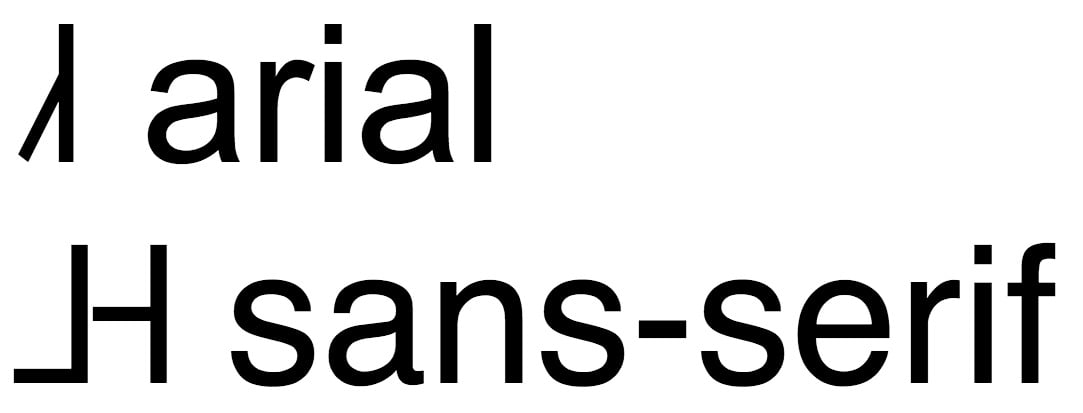
Sans serif fonts (like Arial, Helvetica, Century Gothic, Tahoma, Trebuchet MS, or Verdana) are clean and modern, often preferred for their simplicity and digital readability.
Serif fonts (like Times New Roman or Garamond) have small decorative lines or “tails” at the ends of letters, giving a traditional and polished look.

Here’s a list of ten tried-and-true fonts that work beautifully for résumés — each with its own personality and professional tone:
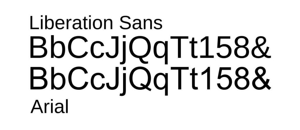
- Arial — A timeless and widely used font known for its clean lines and easy readability, though some consider it a bit too common.
👉 fonts.com/font/monotype/arial - Calibri — A modern replacement for Times New Roman, Calibri displays exceptionally well on screens and adapts seamlessly to different formats.
👉 fonts.com/font/microsoft-corporation/calibri - Cambria — A familiar, professional font designed for on-screen reading. It feels balanced and approachable.
👉 fonts.com/font/microsoft-corporation/cambria - Garamond — Classic and elegant, Garamond draws from 16th-century typography and suits résumés for academic or highly experienced professionals.
👉 fonts.com/font/urw-type-foundry/garamond - Helvetica — A global design icon, Helvetica combines modern appeal with timeless clarity — ideal for marketing, design, or tech résumés.
👉 myfonts.com/fonts/linotype/helvetica - Didot — Stylish and refined, Didot is perfect for creative fields such as fashion, art, or photography, blending elegance with readability.
👉 fonts.com/font/canada-type/didot - Georgia — A dependable alternative to Times New Roman, Georgia was designed for crisp readability on digital screens.
👉 fonts.com/font/microsoft-corporation/georgia - Book Antiqua — Inspired by Renaissance lettering, this typeface works beautifully for professionals in the arts and humanities.
👉 docs.microsoft.com/en-us/typography/font-list/book-antiqua - Lato — Meaning “summer” in Polish, Lato offers a friendly and professional look with multiple weights, great for differentiating sections.
👉 fonts.google.com/specimen/Lato - Roboto — Known from Google Maps, Roboto has a clean, modern feel and works well for startups or less traditional environments.
👉 fonts.google.com/specimen/Roboto
Additional Resume Tips
When finalizing a resume, avoid mixing different fonts in one document. Use bold and italics sparingly for emphasis or section separation.
Resist the urge to include excessive content, which might lead to reduced font size and hinder readability. An ideal font size is around 11 points. Remember, the goal is to make the document easily readable for potential employers.